
Media 180
Youtube- Teec3 (pelase subscribe) https://youtu.be/S4qL7Ch57OI?si=iHvzT2JEQ6_sN-NK

-unit 6-
different genres
-action
-romance
-hybrid
-comedy
-adventure
-horror
-sci-fi
-musical
-drama
-war

film poster case study
thriller:
the genre of the poster is thriller, which is evident to me because of the lighting and colour used. for example there is contrast between the black blank space along the outside of the poster with the centre being light green. this follows a typical pattern of horror posters as they tend to leave room around the outside of the poster and have the protagonist or object be central with a bright light.
furthermore i can tell this is a horror poster from the title, as it scratched out letters give the effect of a creature ready to pounce and attack ; has the audience fell uneasy making us question what the danger could be. In addition the dagger is a prop which immediately signals danger.
the designers have distinctly made the poster so that it fits in with the thriller genre, as they have used a common location such as the woods which is effectively used throughout the majority of thriller movies using knowledge from other thriiler films and integrating it into there own poster, as it relates to the audience. Giving the audience a sense of familiarity makes the film more likely to be successful.
One of the media codes demonstrated is written through the use of a slogan. Like many movies the slogan gives the audience intel into what the movie could be about as well as using specific words to indicate the genre of the film. In this case the short snappy slogan " This land is their land" links to this idea of protection and further makes us ponder about how animals and people would do anything in order to protect what is there's. This feeling of protection intertwines with survival- which often turns violent; can be unpredictable leaving the audience on the edge of there seats.
Another typical media convention here is the wide stance and hand gesture of the protagonist. Within the thriiler genre they commonly use stretched out and dramatized gestures illustrating a tension or friction. In the case of this particular poster the animal like figure has a wide stance and stiff figure as the clasp the weapon in there hand- this implies they are the villain in the story as oppose to the innocent figure which normally is quite timed and cornered in the poster with fearful facial expressions.
The poster is effective as its eye catching animal like figure only shows half of its body creating more mystery around the character. Not to mention the use of mise-en-scene - with the contrast in lighting and colour; use of the dark tree trunks to further create a gloomy shadow along the outside of the poster. This poster appeals to the audience with it big title; use of props to grab the attention of people who are into the horror genre.

The genre of this poster is romance, portrayed by the central protagonists close relationship shown in the poster. Here its clear that they could be something romantic between the two of them because of there happy facial expressions and lack of distance between the two of them making it look like they cannot get enough of each other.
The designers have specifically made it to suit this romantic genre by placing the couple in the centure of the poster and having the bold red title above the characters - this allows the audience to firstly pay attention to the loved up couple and then the tittle of the film "remember me". From the title alone you could guess that the lovers have always had a strong attachment but something disrupts there equilibrium causing there to be a shift in narrative where suddenly the couple get pulled apart, however later on they find each other again and retrace old memories falling deeper in love with one another "remember(ing)" there old romance. This predictable story line from the title and blown up image of the couple suits the romantic genre perfectly. In addition the style of the text used for the title uses a faded look, which links to this idea of memory and how it can fade away just like the title suggest a sense of fading away and trying to remember things.
The bright white background allows the poster to stand out from a far distance, and almost gives this dreamy like feel - which is exactly what love is stereo typically like with its dreamy, beautiful feeling of security and romance. In addition the contrast of the characters navy blue jackets with the white means they can be more central. Another aspect here is the positioning of the two individuals, with the male protagonist almost overshadowing the women. Following onto this the male protagonists name "Robert Patterson" is in bold white writing towards the bottom of the poster to further enhance the fact that he plays a central role within the film. This could be because at the time of the release of this film "Robert" was in demand and popular within the film industry- and by making him the forefront of the poster it makes the audience want to watch the film just because he is in it.
In terms of written technique the designers have used specific words such as "raw" and "gut-wrenching" to describe the performance of the protagonist. These adjectives entice the audience as they juxtapose the idea of a dreamy like love- it also allows us to want to find out more about the characters journey and why this loved up couple on the poster may go through such a "raw" experience. From a technical perspective the framing of the characters seems to be a mid shot, that has been blown up so that the protagonist goes even to the edge of the poster. This stylistic choice follows typical romance posters with the protagonist being the center of attention. However in this particular poster they almost crop the women's coat so that she fits within the frame giving "Robert" more space and dominance. Conventions followed here are the lack of distance between the couple with there jubilant, affectionate facial expressions and the plain colored background intertwined with a bright bold title which almost sums up the plot for the film.
This poster is effective in grabbing the audiences attention to the male protagonist "Robert pattinson" as well as enticing us with the slogan of a "raw and gut-wrenching" performance which offers us a sense of security that this poster can grantee an amazing performance that's worth our while.
It can be argued that this film has a sub genre being both a romance and drama; exploring elements such as coming of age within the film.

The genre of the poster is comedy, which is presented through the two protagonists facial expressions and use of clothing to make the fully grown man appear baby like.
The designers have made it to fit to a comedic genre by firstly using an image of two men who seem to be very close but there is an off-putting imbalance between the two of them not just in size but also in the way they are dressed. Here the photo hints to the audience what the film might be about which could be that the man in red almost acts like a father figure to this adult. This story-line is already comedic as it forces the audience to think about how they got in such a weird position in the first place. In addition the stylistic choice to have a big bold font for the titile fits in with many other comedy film posters as they all seem to follow this pattern- using big fonts and sticking to eye catching colors like red and white. The sub genres of this film include crime; slapstick which is another style of humor.
In terms of codes its clear that the positioning of the characters are purposely done to make us laugh. Not only is the "little man" attached to a baby strap but the other male progtagnaist is leaning slightly back which could also reflect is personality as someone who is comedic and doesn't take life seriously. It also allows the two characters to take up as much space as possible mirroing this concept of them having big bold personalities so much so that they are recognizable in a big room. The mid shot gives opportunity to not only showcase the "little man(s)" obsurd outfit but also represent the casual outfit of the other male protagonist. Cleverly one of the protagonist wears a red leather jacket with matches to the first half of the title which hangs above him. The choice of such a bold color like red allows the audiences attention to be bought to the words "little". In addition the designers have used a plain white background which not only makes the poster visible from far way but also follows patterns of other comedy posters which chose to have a plain background but centure the characters as the main attraction. The fact that the protagonists names are clearly outlines in the headlines suggest that they are big time movies stars and that there name alone is enough to sell the movie to there target audience. To add onto this the slogan placed underneath the elbow "big things come in small packages" further aids the audience to understand this whole juxtaposing idea of "big" and "small" and how it can play a key part in the film. Furthermore the use of the word "package(s)" could implie that the small man would be passed around like a package. The designers then use a more neutral grey color to demonstrate to the audience that this film is in occasion with the people who made "white chicks" which in 2006 would have been very well known to the public- they have also made the "I" in the word "white" fit with the font style of the "I" in little. This USP for the film of advertising the fact that they made "white chicks" promotes there film further as the audience feel a sense of security that this film would also be just as good and also gives room for there film to stand out from other comides that are also being released at the time. These conventions of using bold colors like red,white and other primary colors like blue help to grab the attention of the audience. Some other conventions include the use of one-liners which a short and funny not to mention the large title; massive central photo which all magpie ideas from other comedy film posters giving the audience a feeling of familiarity making the poster so effective and appealing to the audience.


-Reflective Journal-
In this task I found it useful to used Google as a way of finding inspiration from existing film posters, which enabled me to magpie idea's. Utilizing the posters I gathered inspiration for the type of clothing, props and even character facial expressions. Moreover I was able to come up with an affective Marketing Strategy; be self critical as well as taking on advice to better improve my pitch. One thing I needed to reconsider was my target audience as well as the actors. So far this has allowed me to think about the pre-production fazes that are mandatory in order to create a better final product.
-mind map-

reflective journal-
using a digital mind map i was able to piece together different ideas for a comedy poster - this format allowed me to easily take my ideas and organise them in a way which i can later refer back to.
Research from google and helpful sites such as (the one rob recommended) enabled me to gather professional advice.
Finding and sourcing words that aid in selling and appealing to an audience (e.g - guaranteed success) gives reassurance.
I soon started to work on the design of my powerpoint and think of ways i could pitch my ideas.


-Comedy pic's-

-reflective journal-
I went out to take photos that tie in with the comedy genre for my posters. from numerous locations around the school i was able to use different shots such as (cu, ms, etc.) to almost make a collage of ideas.
Experimenting with the camera


We went out as a group an experimented with the ISO, changing it from ISO (200) and even (800) to see the difference. I can see that it effects how dark the image can turn out, due to the cameras sensitivity to light.


Here by shifting the aperture to let in more or less light, it made parts of the image really bright (e.g-like the last image on the right.)
The Shutter speed shifted how long the shutter of the camera took to close which effected what parts of the image was in focus.

-risk assessment, release form, location-recce, Equipment List-


-Reflective Journal-
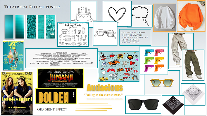
During this phase of creating my Pre-Production document, I used Mood-boards to display my initial ideas for the types of colours/ fonts etc. - that I would incorporate in my posters. This allowed me to gather an idea of the aesthetic I want to achieve and graphics that will best suit my posters. For this particular task I found it helpful to find images from websites such as Pinterest.
In order to write up my Risk Assessment I looked at previous examples from other students; reflected on the way I will take photographs for my film poster's. I considered location; how this could affect the safety of both the crew and actors, as well as the props I'm using such as the (Water guns) that could potentially pose a hazard.
To make sure that I completed this to the best of my ability I also read up on official documents from online sites that listed any other risks to scrutinize.
The Location Recce document aided me to plan out the locations I'm using and their availability. Furthermore, my Equipment List mapped out the type of lighting I needed to achieve for a "bright"; "cheerful" look in my actors. The document makes sure that I remain organised and not forget any equipment. Moreover, the Release provides confidentiality to my actors - as they sign over permission to the listed statements within the document.
As a whole continuing research; idea development means I've pieced together the final aspect for my film posters, by adding to existing ideas and making the final product greater.

-Photoshop practice-
reflective journal:
Today I found it useful to start planning out how my theatrical release poster would look in photoshop once everything had been finalised. I manged to roughly work out where each element would be placed (the title, credits, tagline etc.)
I purposely left a big blank rectangle in the image as this would be where my main photo of the two protagonists will be. Furthermore, i found that i need to begin to work on the poster logos that will be placed towards the bottom of the poster. I am planning to do this using different shapes and fonts to make it seem as realistic as possible.
next i plan to continue to use photoshop to work on my poster, and hopefully be able to add in an image; logos to make the poster look more complete.
-Poster progression-


- REFLECTIVE JOURNAL -
Today i needed to take photos for my posters and overall, i felt it went successfully considering i was working with new equipment which i haven't used before such as (LED lighting and a green screen). Furthermore, i had a cancellation from one of my models which resulted in me having to branch out to a stranger in college; negotiate with them convincing them to take part in my shoot. Luckily the young lady agreed and i manged to replace my model effectively and work with the props i had manged to bring in. In addition, i explained to the models how i wanted them to pose to achieve the comedic look i was aiming for.
Once my photos were taken in the studio i had to take the memory card out and sort through the images i was planning on keeping. During the shoot i took lots of photos for backups which prolonged the time i spent going through the images afterwards. However, i don't regret this choice as it meant i had enough photos to pick from and also meant i could avoid having to re-take any images. During the process of sorting through images, i opened up Photoshop so i could get an idea of how my top selected images would appear on my draft posters which were created beforehand.
I found that the images with more light tended to be more difficult to work with when trying the mask, the outline of my actors and overlay them onto another image. Therefore, i found it more effective to work with the darker images and then adjust the look through the (contrast, brightness etc.) afterwards. At the end of this process i was left with 3 posters that where partially completed. Unfortunately, my theatrical release poster took up too much storage and i ended up losing some work towards the end- despite this i still think the day was a success.
Later on, i plan to fix the storage issue and upload the image back onto the theatrical release poster even if it means having to re-do the outline and follow additional You- tube tutorials to educate myself. I also aim to have the finalized draft posters completed by this Friday.
-COLOR CHOICE
THEATRICAL POSTER - TURQUOISE CALMNESS AND CLARITY AS THEY FIND THERE WAY (portray clarity and confidence)


Poster reflective journal
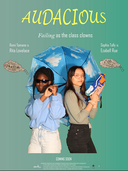
Today I worked further on my posters using photoshop to cut out the green screen for the photo in the character poster. In addition I re-adjusted where the photo was positioned on the poster and decided that due to the cut off point for the picture it looked more professional to place it at the bottom of the poster, so that the characters don’t look like they are floating. Afterwards I used the gradient effect for the title and changed the background to a more neutral colour to fit in with the indie comedy genre that I seemed to be leaning towards.
Moreover I felt it necessary to draw out the doodles of thought bubbles that would be on my theatrical release poster. Once this was done I removed the background of the paper and used the select and mask tool to get the desired effect I was aspiring for. Then I imported this picture to the poster itself and edited more of the fonts on the poster.
Lastly for the teaser poster I used the overlay tool for the title and changed the opacity for the background photo of one of the protagonist's hands. I also made changes to the hallway picture by editing its brightness/contrast. Overall I used this day to make as many alterations as I felt necessary.
however I wanted to continue my work on photoshop but ran into some technical difficulties. Photoshop indicated that the hard disk was full and refused to let me save my work or make any more edits. Therefore I used the snipping tool to take a screen grab of what work I managed to get done before I lose anything else. In conclusion it was a productive day however I was disappointed with not being able to further complete my posters.
-Poster Progression-


Reflective Journal -
I have decided to use an outter glow on the outline of my protaganist for my character posteer. I also will be increasing the vibrancy of my teaser poster, so it looks less whitewahsed. taking up advice from my teacher i will be adding my draft scetches of (onomatapia symbols) to the theatrical release poster. Not to mention substituting another tagline in the teaser poster; replacing part of the colour for the tagline in the theatrical release poster whilst mantaining the same font. During my session today i had to again re-do the work from last lesson due to photoshop not saving the work from beforehand.
The scetches i intend on adding to my theatrical release poster are below...


reflective journal -
For my teaser poster I especially like the element of mystery that I have created by not giving to much away about what will happen, but instead revealing the location through the use of imagery using the lockers in the background. In addition to this the glasses (prop) slipping away from the protagonist hands makes it evident that she is trying hard to be "cool" but almost misses the mark. not to mention the glasses are featured in both of the other posters which allows them to all connect together. In addition the alteration to my tagline gives the poster a fresh outlook to the audience.
reflective journal -
this approach of a glowed outline surrounding my models, with the black boxes labelling their characteristics is a unique approach. Not only is the poster non conventional but it also is vibrant and fitting to the rest of my "out there" look. I am pleased with the final outcome of my poster although I still favour my teaser; theatrical release poster more.
reflective journal -
with the graphics, colour, font and in general complete look of this poster I couldn't be more satisfied with its final appearance. especially since I spent the most amount of time creating it. I think the efforts to hand draw part's of the elements combined with the work it took to photograph my models, the poster certainly is eye-catching from far-away. It meets the main objective to really draw my target audience (teenagers) into wanting to know more about "audacious"
Reflective Journal -
I now feel I have completed my posters and I'm working on writing up my evaluation for this project. In todays session I was able to add the hand drawn graphics as well as last minute adjustments to the (brightness, contrast etc.) until I was fully satisfied.
-evaluation-
I was asked to plan, develop, and produce a print marketing campaign for my chosen genre (comedy). I was able to complete a Theatrical Release poster, Teaser poster and finally a character poster whilst following the brief from the company (Alphapanda).
Key challenges that I faced were technical issues with photoshop - losing work due to the hard drive being full. In addition, I found it difficult to navigate the range of tools available on photoshop. However, after this project i have learned a lot more and I even find that I am enjoying using and learning more about photoshop, as opposed to the frustration I felt using the software at the beginning of the assignment. Furthermore, some other problems I’ve come across are using equipment such as a green screen and having to edit it out in photoshop. This was due to the fact that one of my protagonist’s hairs was curly towards the bottom and this left gaps for the green screen to show through even though the background had been removed; the image was already (selected and masked). In order to overcome this, I had to individually go through the pixels, zooming in and out to eventually make it appear as if the green screen was never there.
I also needed to use a LED light, but due to my lack of knowledge on lighting I was not aware that I would need two lights, so that I can place them on either side of my protagonist during the shoot. Due to the reduction of the additional LED and no light reflectors, the gradient of the green screen was not as evenly distributed as it could have been. Therefore, in photoshop I had to adapt the lighting so that the exposure of my image was not too bright, making my protagonist have too much of a yellow tone. I became irritated by the number of changes to the set I needed to make during the shoot just so the lighting did not appear to dim. However, I now take on board the value of equipment such as lighting used in photography in order for the image to look of a high quality.
Moreover, on the day of the photoshoot, one of my models to pose for the posters cancelled at the last minute. This resulted in me having to find a last-minute resolution to find a willing model to pose as one of the main protagonists for my film posters. So, I needed to go down to different classrooms and ask individuals if they would like to take part. I also had to explain what I needed them to do and why I was doing the project in the first place which was time-consuming. Now at first, I was having no success as some people felt too shy to pose as a comedic fool, which is of course understandable. But I was directed to another classroom where I managed to bribe someone by proposing my pitch; of course, a chocolate gift in order for her to accept my offer, leaving me extremely thankful to her. The experience of having to sell my ideas; use problem solving skills in order to conquer a hurdle has allowed me to feel more comfortable in working with pressured situations.
Overall learning how to manage time and rise above obstacles, has made me further respect the process of (both pre-production and production) that goes into producing film posters. Although I underwent periods of exasperation from losing work, I still feel I've learned valuable lessons which could help me progress in the media industry later on. These challenges have portrayed that even if something is new to you there are always people who can support and give their advice. I now see asking for help isn't a sign of weakness but rather a way to show willingness to take a new approach.
What I believe I did well is coordinating timings to ensure that all my pre-production work was completed before I began to do any of the practical aspects. I believe I was able to carefully think about my ideas, grouping them visually onto mind maps, mood boards and even sketches which I was able to use in my theatrical release poster. I think these ideas were realistic as well as achievable, permitting me to meet the deadline and take pressure off finishing the posters. Additionally, elements that I could have improved on were learning more about photoshop beforehand or even understanding more about camera equipment used to take photography.
Besides this I feel I have met the requirements of the brief producing three posters that are suitable for professional use. I argue that I've carried out detailed research on iconography; codes and conventions for film posters within the comedy genre as well as brief work on the horror and romantic genre demonstrated in task 1. Following the indie comedy film poster code and conventions my work is colourful with a large defined title and typically uses large images to entice the audience. The poster also conforms to the stereotypical graphics, and bright lighting with written codes following my choice of writing styles I've included. My posters do also subvert some expected features, for example the positioning of some of my graphics. In my theatrical release poster, I think the graphics are less spaced out and the poster itself is more crowded with other elements, but this is all intentional.
In order to improve, I think I will watch more YouTube tutorials such as (The Media Insiders videos on producing movie posters in photoshop; -Mir Rom’s- tutorials on cool effects to add in). These tutorials could teach me blending; sharpening techniques as well as how professionals within the film poster industry plan and develop posters to entice a target audience. On top of that I believe making bullet point notes would be beneficial for me as I take a more visual approach to learning. I also have the option that taking photographs in my own time and doing individual work to edit on photoshop through experimenting would also allow me to become familiar with the software, so i can become more at ease with it. Hopefully all this would ameliorate my photoshop experience for next time.
In conclusion I feel really proud of my final work, and even if editing film posters as a career path does not interest me, I still hold the view that I've learned so many practical lessons, which could come in use for future projects. For instance, skills I have expanded upon is directing, which I practised during my photoshoot for my models, ensuring that they posed in the correct position and guiding them into certain facial expressions, gestures. I also have taken more knowledge away on how lighting works within photography and how to frame individuals within the camera to achieve a professional look. Therefore, I am pleased with all the work I have committed to as my first attempt at producing three different film posters has turned out brilliantly.